Spot now includes a selection of icons & new pulse animation for overlays
Spot now includes a selection of icons
Our spot overlay got a major upgrade - we are aware that the Spot we had was very basic and had no real use case – yes, it sucked. But that changes with this release as it now supports the option of displaying 6 different icons. Newly introduced was also the option to select how big the spot should be. Via a dropdown, you can choose between “small”, “medium” and “big”.

New pulse animation
Animations were a big part of one of our latest updates but this release features something that has nothing to do with the changes that were introduced in May. The Spot and Button by default have a small pulse animation even when no attention-seeker is selected. Usually, we do not force any default options on our users as we want to give them as much flexibility and creative freedom as they want – but with this update, we decided that this animation should be active by default. There is also no option to disable it – firstly we do not want to make our software more complex and secondly, we strongly believe that this animation boosts click rates and therefore we do not see why someone would disable it :)
Small changes
Instead of me continuing to rant about my decisions, let’s move the topic to something fun: bug fixes! Yes, there were some – please do not ask any questions… most of them are too embarrassing to list here.
Have a good day and thank you for using Clipflip.
Jakob Sturm
Head of Product
Recent Updates
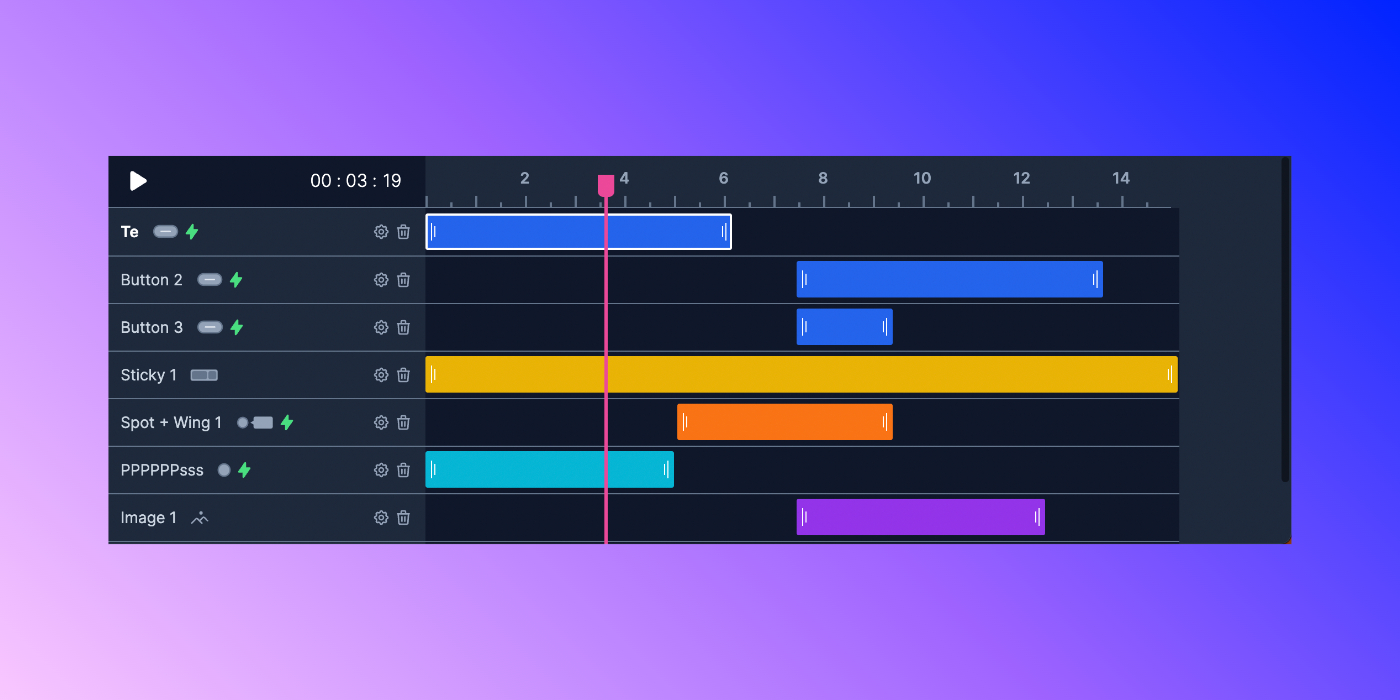
Undo/Redo & alignment helper & new timeline styles
Deployed on: 2022-07-19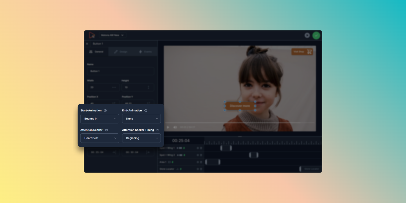
In-/Out-Animations & attention seekers & new hover effects
Deployed on: 2022-06-21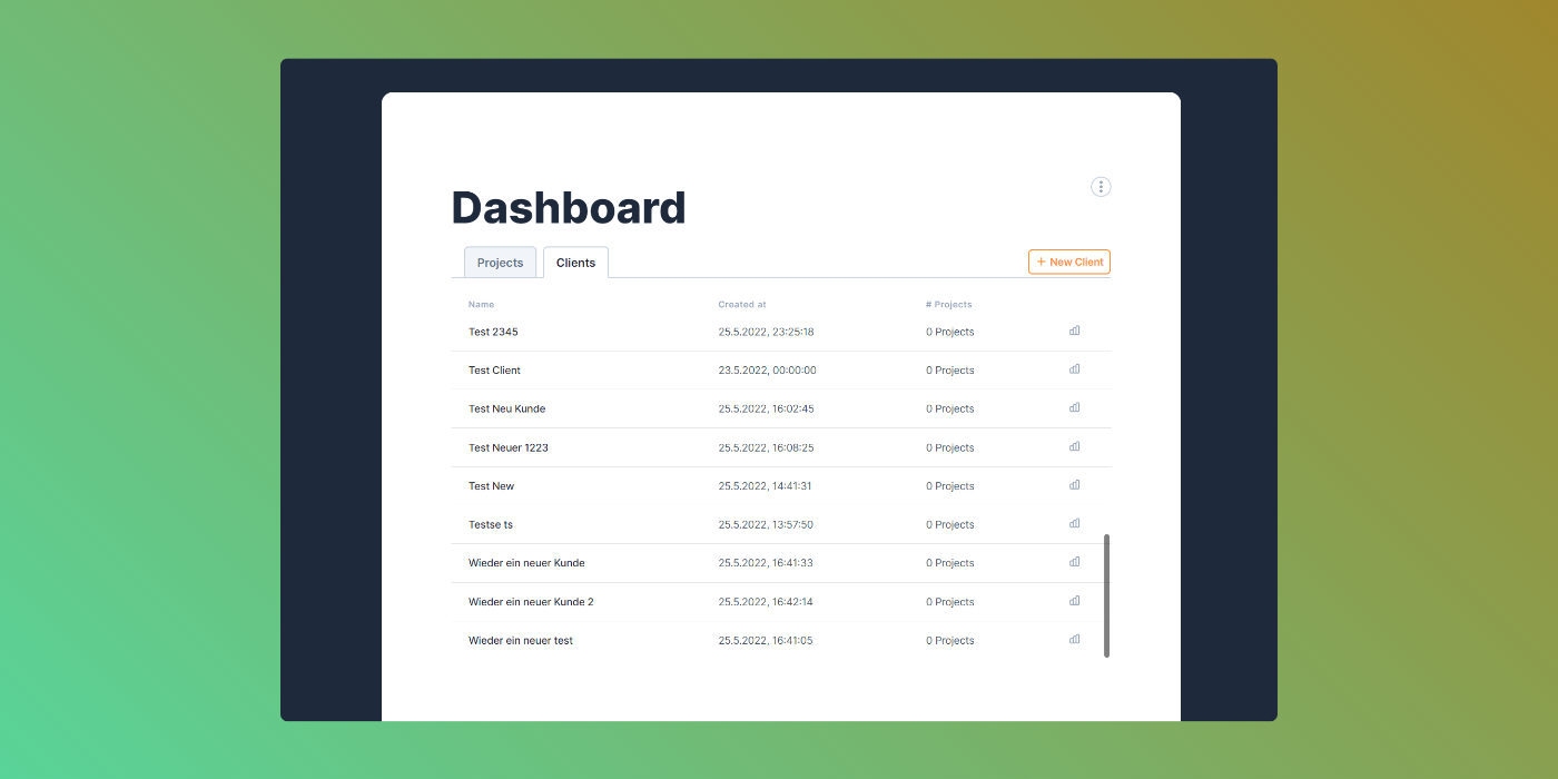
Create & manage clients
Deployed on: 2022-06-03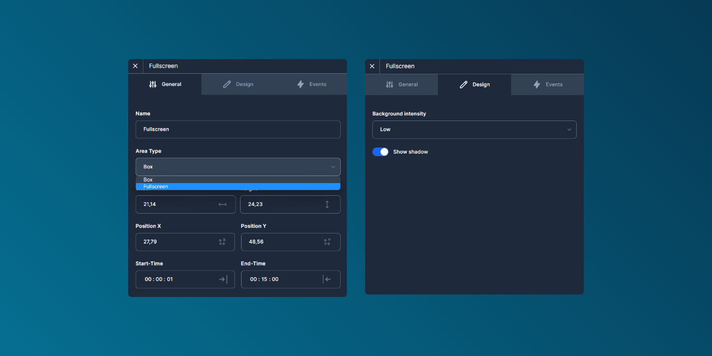
Adjust editor panels, new event-area type and timeline style updates
Deployed on: 2022-05-19